In this post I will attempt to explain how I used Pandas and Matplotlib to quickly generate server requests reports on a daily basis.
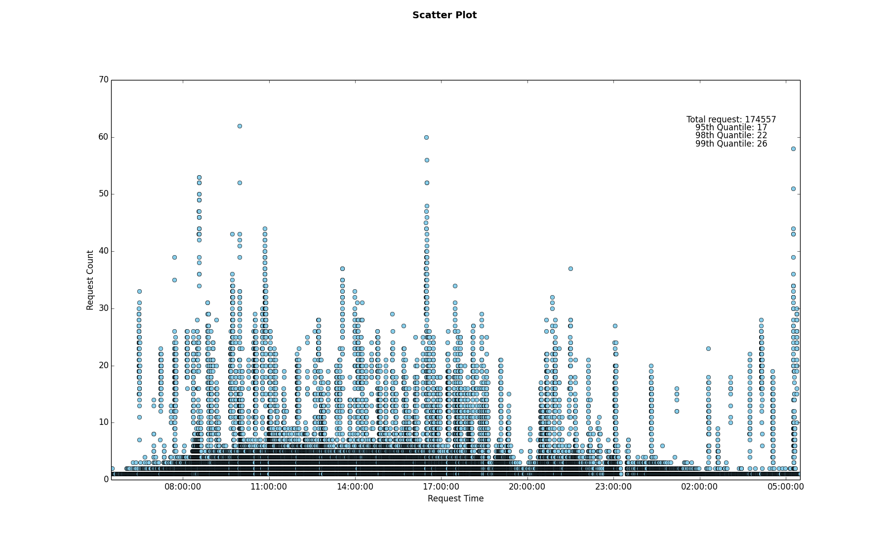
Problem To Be Solved: Generate a Scatter plot of the number of requests to a particular URL along with the 99th, 95th and 90th percentile of requests for the duration of a day.
Breakdown:
- Reading multiple server access log files.
- Parsing the timestamp fields so that the graph can be scaled appropriately.
- Aggregating the timestamp fields.
- Calculating the Quantile values.
- Generating the Scatter Plot.
In this post I will leave out the details related to point number 1 and will concentrate on the remaining points. Since this was a fairly mundane task and had to be done daily for a couple of weeks, I intended on automating the process as well as generating the scatter plot as quickly as possible.
Parsing the timestamp fields so that the graph can be scaled appropriately
Let’s assume the input file contains only timestamps and the file has been read into a list using the following code.
lines = [line.rstrip('\n') for line in open(file_name)]
Since the x-axis of the scatter plot will contain timestamp values, the lines List which currently contains string values, needs to be converted into a List of timestamp values. My initial instinct was to use an explicit for loop. In an effort to speed up my script I came across python’s built-in map() function and the concept of List comprehension which reduce the for loop overhead when the loop body is relatively simple, check here for more details. After a bit of benchmarking I settled on using the List comprehension method.
1
2
3
from datetime import timedelta, datetime

dt_lst = [datetime.strptime(date_str, '%H:%M:%S') for date_str in lines]
Aggregating the datetime fields
In this aggregation step the goal was to perform a group-by on the timestamps in order to calculate the number of requests per second. To achieve this I used Numpy which is a package for scientific computing and Pandas which is a data analysis library. The Series and DataFrame objects from the Pandas library and the ones() method from the Numpy package are used to generate the data structure show in Figure 1, the code snippet below contains the details.
Note: I could have probably achieved the same result using only Pandas.
1
2
3
4
5
6
7
8
9
10
11
12
13
import pandas as pd
import numpy as np
from pandas import DataFrame, Series

# Create a Series named "Request_Time"
sr_dt = Series(dt_lst, name='Request_Time')
# Create a DataFrame using the Request_Time Series
df = DataFrame(sr_dt)
# Create an array of 1's using Numpy
count = sr_dt.size
ones = np.ones(count, dtype=int)
# Add the ones array to the DataFrame with the header "Counts"
df['Counts'] = ones
The DataFrame object is a tabular data structure with labeled rows and columns, you may think of it as an Excel Spreadsheet. After creating the DataFrame df you will end up with a structure as displayed below.
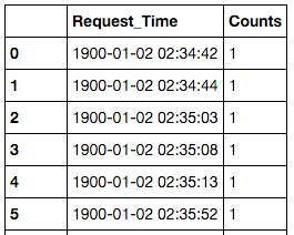
Figure 1: Pandas DataFrame
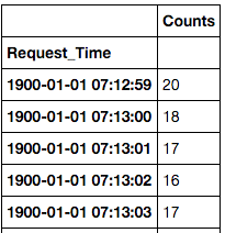
The next step is to group-by the Request_Time column and sum up the counts, this is achieved by calling the groupby method on the DataFrame object.
1
grouped = df.groupby('Request_Time').count()
This gives us an aggregated DataFrame as displayed below
Calculating the Quantile values
Calculating the quantile values on the aggregated DataFrame can be done by calling the quantile() method which returns a DataFrame containing the value and the dtype.
1
2
3
ninety_five_quant = grouped.quantile(.95)[0] # [0] since we only need the quantile value
ninety_ninth_quant = grouped.quantile(.99)[0] # [0] since we only need the quantile value
ninety_eight_quant = grouped.quantile(.98)[0] # [0] since we only need the quantile value
Generating the Scatter Plot
The Scatter plot is generated using the Matplotlib library. Since we are plotting timestamp values on the x-axis we will use the plot_date() method.
1
ax.plot_date(x, y, xdate=True, ydate=False, color='skyblue')
The x-axis contains the timestamp values, the y-axis contains the request counts, xdate=True indicates the x-axis contains date values.
Note: The Matplotlib library contains extensive documentation on all it’s API’s as well as a vast array of examples, hence I will refrain from going into more details in this post, you may check this link for more details.
The snippet below contains code related to rendering the Scatter Plot. I have taken a very simplistic and naive approach since it was good enough for my requirement.
1
2
3
4
5
6
7
8
9
10
11
12
13
14
15
16
17
18
19
20
21
22
23
24
25
26
27
28
import matplotlib.pyplot as plt

total_req =  'Total request: ' + str(count)
nine_five_quant_str =  '95th Quantile: ' + str(ninety_five_quant)
nine_eight_quant_str =  '98th Quantile: ' + str(ninety_eight_quant)
nine_nine_quant_str = '99th Quantile: ' + str(ninety_ninth_quant)

# x and y axis values are extracted from the grouped DataFrame
x = grouped.index
y = grouped.values

print 'Plotting Graph..'
fig = plt.figure()
fig.suptitle('Scatter Plot', fontsize=14, fontweight='bold')
ax = fig.add_subplot(111)
fig.subplots_adjust(top=0.85)

ax.set_xlabel('Request Time')
ax.set_ylabel('Request Count')

text_x_axis_value = 0.9
ax.text(text_x_axis_value, 0.90, total_req, horizontalalignment='center', verticalalignment='center', transform = ax.transAxes)
ax.text(text_x_axis_value, 0.88, nine_five_quant_str, horizontalalignment='center', verticalalignment='center', transform = ax.transAxes)
ax.text(text_x_axis_value, 0.86, nine_eight_quant_str, horizontalalignment='center', verticalalignment='center', transform = ax.transAxes)
ax.text(text_x_axis_value, 0.84, nine_nine_quant_str, horizontalalignment='center', verticalalignment='center', transform = ax.transAxes)

ax.plot_date(x, y, xdate=True, ydate=False, color='skyblue')
plt.show()
Summary
In this post we have seen how:
Listcomprehension can give us better performance over an explicitforloop when the loop body is relatively simple. Please check here for more details on the topic.- The
Pandaslibrary can be used to calculate aggregates and quantiles. We used theSeriesandDataFrameobjects which are the core data structures of thePandaslibrary to achieve this. - Generate a Time-Series Scatter Plot using the
Matplotliblibrary.